Conference program
The conference took place at Pakhuis de Zwijger in Amsterdam on .
Registration

NUI: What's in a Name?
— Bill Buxton (Microsoft Research)
Natural User Interface (NUI), is one of the favorite flavors du jour in certain interaction design and user experience circles. The term signals a change from the Graphical User Interface (GUI), that has been prevalent since the early 1980s. In many ways, that is good - not that the GUI is going to go away (any more than the QWERTY keyboard) - but progress does, as they say, progress. And just because there was a great idea that took hold, does not mean that that is all that there is.
But beyond the name, what is this new thing? The answer depends on who you ask. Ask enough people, and you will see that it can mean anything — which means that it might mean nothing. According to Bill Buxton, the many views means that there is a lot of diverse conversations accompanying them, and he sees that as healthy. Complacency is rarely a worthy aspiration for design. But out of the collective conversations one would hope that there is some convergence, insight or growth.
The purpose of Bill's talk is to throw his own thoughts into the fray. Taking his cue from the term itself, he'll start like a good naturalist, and strip the term bare, and build from there. Starting with diving into the essence of the term natural.
Bill Buxton is the author of, Sketching User Experiences: Getting the Design Right and the Right Design, as well as a columnist on design and innovation for BusinessWeek.com. He is Principal Researcher at Microsoft Research and has a 30 year involvement in research and design around human aspects of technology, and digital tools for creative endeavor, including music, film and industrial design. Prior to joining Microsoft, he was a researcher at Xerox PARC and professor at the University of Toronto. In 2010, BusinessWeek named Bill among the World's Most Influential Designers.
Coffee break
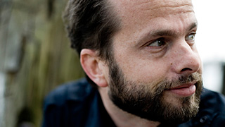
Augmented Museum Experiences
— Jacco Ouwerkerk (IN10)
UAR (Urban Augmented Reality) is the world's first mobile architecture application featuring augmented reality with 3D models. You can see and experience the built environment of the past, the present and the future, via an iPhone and Android application. The Netherlands Architecture Institute (NAi) has set itself an incredible challenge: to make The Netherlands the first country in the world to have its entire architecture viewable on smartphones thanks to augmented reality.
In this session Jacco Ouwerkerk will share his experiences and knowledge of the UAR realization till now with a focus on concept development and interaction design. He will also give a broader perspective on the role of augmented reality for museums. Jacco will show and discuss how to 'augment museum experiences' outside the museum walls.
Jacco Ouwerkerk is an interactive concepter developing open museum concepts at IN10 Communication, an creative agency that creates interactive communication for brands and museums.
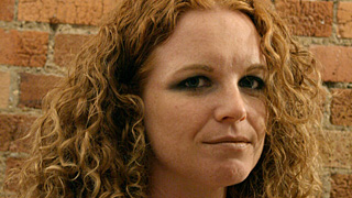
The Psychology of Creativity
— Claire Rowland (Fjord London)
A lot of hot air and expensive business consultancy time is sold in pursuit of facilitating creativity but the creative process is still thought of as a mysterious black box, often the preserve of certain people and not others. But what's the actual science behind it? Are some of us more creative than others, and if so, why? What can all of us do to help ourselves have more and better ideas? This talk offers a brief introduction to the psychology of creativity.
Claire Rowland is a service design lead and research manager at Fjord London. She has 13 years' experience in UX roles for companies such as Flow Interactive, Razorfish and Credit Suisse, working on user insight research, concept evaluation, interaction design and IA for web, mobile and PC applications and multi-channel services.
Lunch

Turning the Corporate Battleship with Design
— Andrei Herasimchuk (Yahoo!)
Designing interfaces for digital products like the Apple iPhone or an interactive web application like Yahoo! Mail promises to be one of the hottest job design prospects for the next century. Nearly every product type we know about has gone or is going digital, from content rich websites like CNN.com to mobile task-based applications like Gowalla to products for the digital home like Netflix. But even when one has great ideas, or creates innovative design for their products, how does one get their company or clients to institute positive change through their work?
In this session, Andrei Herasimchuk will divulge lessons learned from the trenches on how to get large, global corporations to make big changes through Design. What works, what doesn't and how to keep yourself inspired when tackling such large projects. In doing so, he aims to pass on key factors to success while inspiring designers everywhere to tackle the challenges that face them in the workplace, helping them to overcome the inevitable obstacles that will arise in their path.
Andrei Michael Herasimchuk was the lead designer behind the Adobe Creative Suite and the product lead for Adobe Lightroom. He was Chief Design Officer for Involution Studios, a digital product design company based in the United States and recently joined Yahoo! He is now leading the product design team in the redesign of one of the internet's largest web-based applications, Yahoo! Mail, across web browsers, desktop clients, mobile smartphones and tablet computers. His writing and thoughts on design can be found at his blog, Design by Fire.
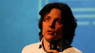
Creating People for Interfaces (Discussion)
— Ianus Keller (For Inspiration Only)
In 1986 Bill Buxton gave a unique perspective on the WIMP interface by anthropologically reconstructing the human from the computer with its hard- and software interface. This Homo WIMPi had "a well-developed eye, a long right arm, uniform-length fingers and a "low-fi" ear."
Given the progression in interfaces in the last 25 years, the reconstructed human may need to change as well. In this hands-on, plenary workshop, we will try to reconstruct our users based on our new touch, gestural, speech and other natural user interfaces. Based on this reconstruction we will discuss what paying more attention to the body language implies for designing user interfaces that are easier to learn and use.
Ianus Keller is a designer and researcher interested in blurring the line between the physical and digital realm. He is trained as a product designer and received his PhD on tools for inspiration. He currently teaches, consults with For Inspiration Only and co-organizes the This happened — Utrecht lecture series.
‘Alienzz’, acrobatic theater performance by the Oddlings
Coffee break

A Smattering of Prototyping Interactions
— Sascha Wolter (wolter.biz)
We all know that attractive Visual Design and exemplary Software Architecture are not solely the keys to successful applications. It is the complete User Experience that counts! But how can you create early interactive prototypes of your idea without bothering about the final technology and programming in general? Especially when there is only half knowledge of code and/or visual design? Sascha Wolter gives you an answer and demonstrates prototyping common applications based on raffish and inspiring ideas. The spectrum ranges from Voice- to Gesture-control, from Wii Remote input to Lego Mindstorms output.
Sascha Wolter is a professional developer and interaction designer of rich applications. He also works as a consultant, trainer, software-architect and author on a freelance basis and contributes articles to a number of magazines. His books and DVDs on Flash are best selling publications in Germany. He has been giving lectures at conferences like “Flash on the Beach” and “Flashforward” for several few years now. Sascha is also the founder of the leading German Adobe User Group flashforum.de.
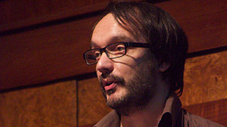
Information is Beautiful
— David McCandless (informationisbeautiful.net)
The use of infographics, data visualisations and information design is a rising trend across many disciplines: science, design, journalism and web. In an age of high-speed living and info overload, visualized information has incredible potential to help us quickly understand, navigate and find meaning in a complex world. David will share his passion for this merging of design, information, text and story to unveil some of the interesting, unexpected and sometimes magical things that happen when you visualise data, knowledge and ideas.
David McCandless is a London-based author, data-journalist and information designer. With his blog and book, Information Is Beautiful, he has championed the use of infographics and data visualisations to explore new directions for journalism and design - and to discover new stories in the seas of data swamping and surrounding us.
Drinks (kindly sponsored by Fier Concept & Design)
